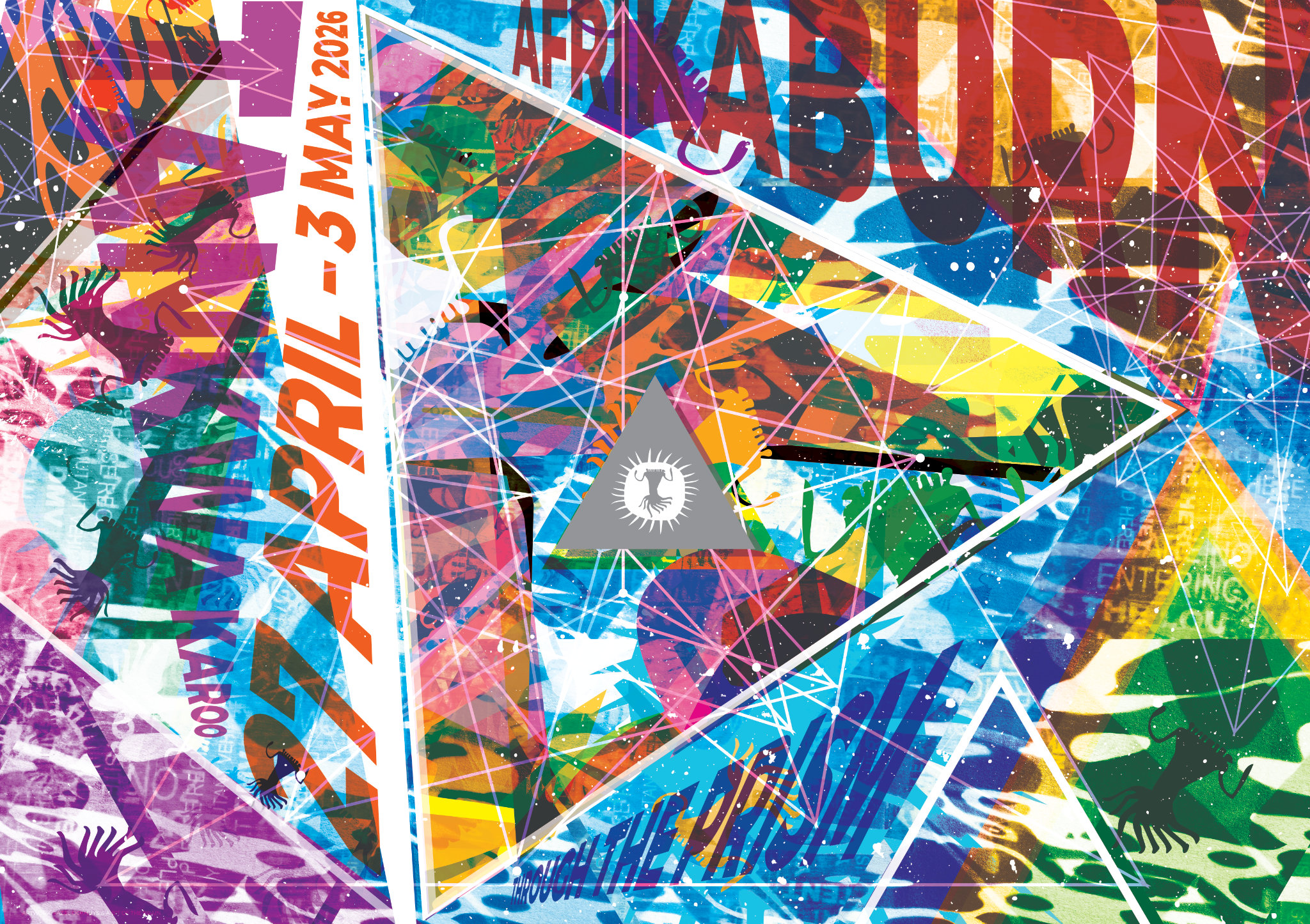
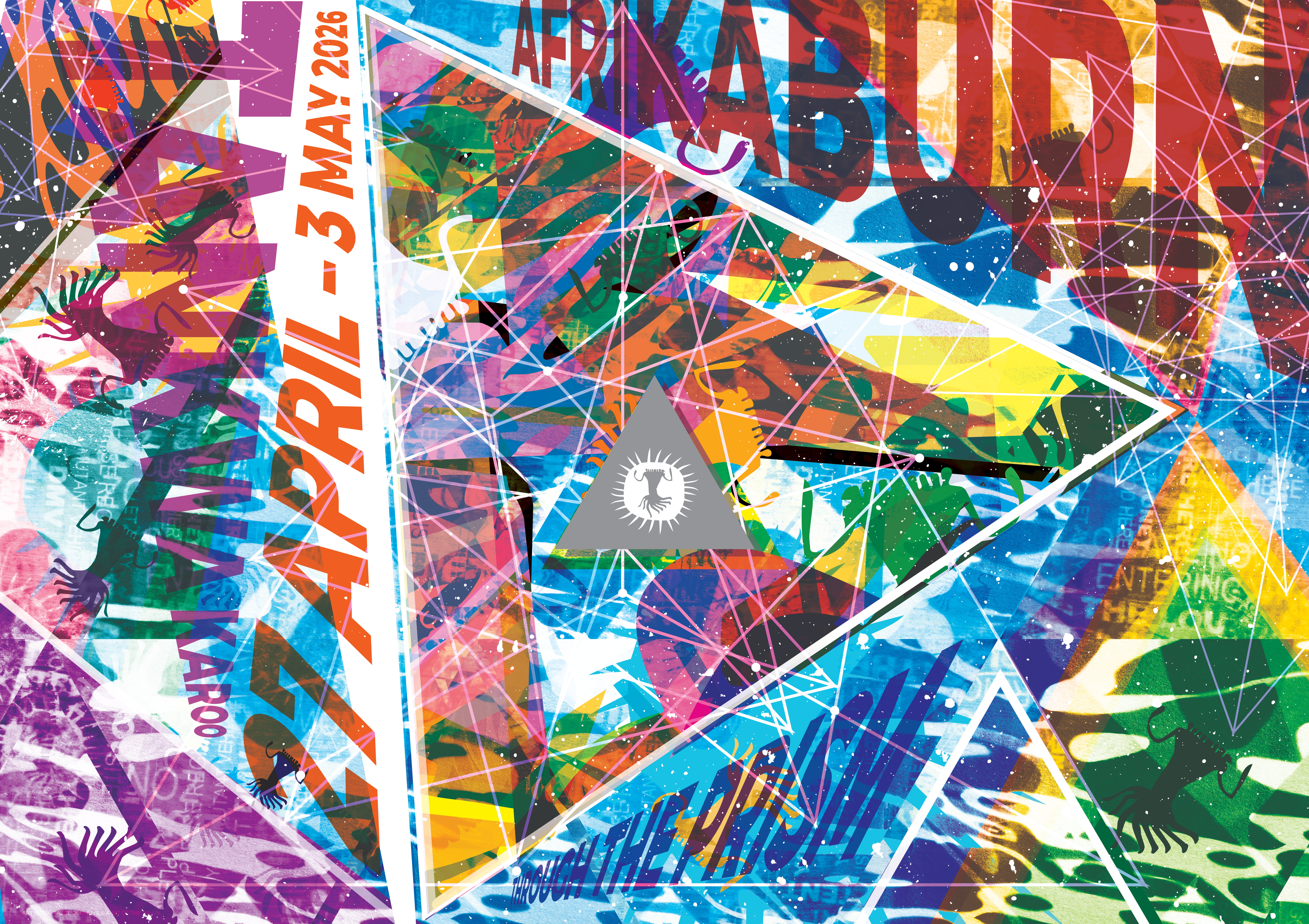
This year’s poster artist Fazel Ockhuys, writes:
It all started quite casually at a BosBeraad when The Brain invited me to volunteer to create the 2026 poster. What began as a light moment slowly turned into a reality – and now we’re here. Through the Prism is an interesting theme. I leaned towards the idea of reflection – both in a physical sense and in a more internal one.
Initially, the idea was to make the poster interactive by creating a black-and-white etching for folks to colour themselves. I thought it was quite a unique perspective – people express things in their own way because we view things differently, essentially, every piece would be an original version of Through the Prism.
All my ideas sounded lovely in theory, but what would that look like? Haha, I had no clue, but I knew that by playing and experimenting, I could create something exciting.
The Brain suggested adding a bit of chaos and experimenting with light-based image-making. That led us to cyanotypes (sun prints). I thought, why not! It’s fun and something I’d never done before. I made a series of cyanotype prints, playing with sun rays (and other goodies). While scouring the office for things to use, Janine kindly gifted some old DPW signage transparencies on clean-up day … Old words and AfrikaBurn ephemera became a part of the print-making process.
At one stage, it started looking a bit like the ideal Out of the Blue poster (last year’s theme!). And that’s where I got a bit stuck. I also had a few meltdowns (design software crashes paired with a deadline that I wanted to meet)
I took a short break, and The Brain stepped in and pushed the piece a bit further, building up the layers and pushing a few more visual boundaries. And so it seemed like the poster was getting busier and denser, the more I refracted and reflected on the artwork. The next challenge was finding balance from within the chaos – and a composition that worked. I had this thing that needed refinement.
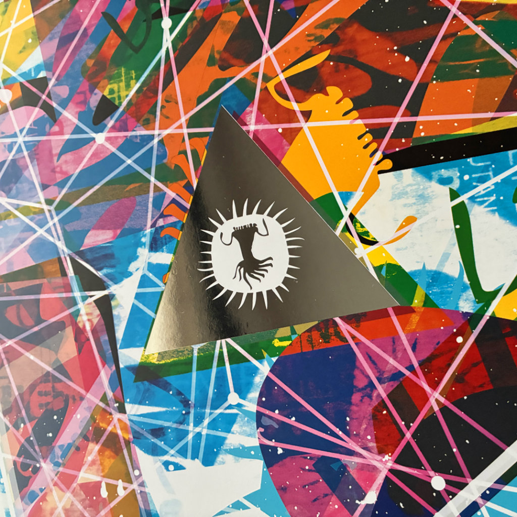
It needed to have a simple visual anchor, a place of calm for your eyes amongst the chaos, and I settled on a simple triangle prism in the centre of the poster with the AfrikaBurn signifier.
One thing I was very certain about was that the poster needed an element of surprise, something special. Kinda like the great reveal (that Robert frequently talks about) at the top of Quagga-Kop, and that’s where the mirror finish comes from … it plays well with the themes of reflection, refraction, and changing perspectives. Also – a bonus, it invites you to see yourself Through The Prism!
The final poster became a hybrid of processes: traditional cyanotype printing combined with digital composition. The colour palette evolved into a vibrant one, which felt appropriate given the personalities and energy of our burner community.
Ultimately, the goal was fairly simple. I wanted the poster to do two things: to catch your eye at a first glance, and then to draw you Into The Prism.
2 Responses
Love the journey! Thank you for all the rainbows 🙂
You are amazi g Fazel we love u Greeters Greeters Gülden